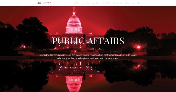
#1- Giant, gorgeous background images.
This is one of the easiest way to make your website stand out. Using large, impactful images catches the users attention immediately. And it’s easy to hold their attention with strategically placed content on top of or directly below the image. Your site automatically feels powerful and professional.
#2- Card Design
What is card design, you ask? Pinterest, basically. Card design uses modular columns to arrange a lot of imagery and data into a succinct system. Users find themselves lost in an endless and entertaining scroll. Expect to see more of this style in the next year on sites other than Pinterest.
#3- Less Clicking, More Scrolling
The one page parallax was a dominant web feature in 2014. Prepare to see the one page characteristic stick around, with or without the parallax. With more and more users browsing on mobile devices, scrolling through sections of content without leaving the page is a big draw.
Feel like these techie trends are out of your reach? Thank again. Divi is a WordPress theme that can be transformed into any business’ dream site. It also contains tons of different options for building the perfect site, which can include any or all of the above trends.
Check out a demo of Divi.
