What exactly is responsive web design?
Chances are, you’ve browsed the internet on more than just one type of device in your time online. Responsiveness refers to any given website’s ability (or lack thereof) to scale and rearrange visual elements so that information is easily accessible on any screen size — from the smartphone in your pocket, to tablets, phablets, laptops and desktop computers. Given that there are about as many possible screen sizes as there are models of internet-capable devices, this is a consideration that becomes more important every day.
WordPress is well suited to responsive web design since many of the “rules” internet browsers follow for displaying webpages are built in to the theme’s code. Rather than having to build separate websites for mobile and desktop, this enables all devices to load the same URL with individual elements in logical places.
Why doesn’t everything just shrink to fit on the screen?
While this seems like a straightforward solution, it actually makes things more complicated both from a technical and end-user perspective. We’ll discuss the latter first.
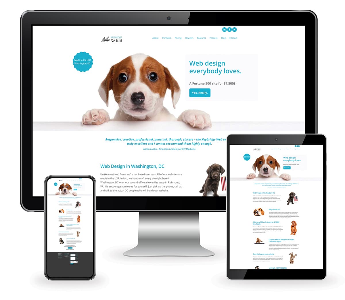
To illustrate, here’s what our Keybridge Web home page would look like if the desktop version were scaled down proportionally to fit a generic tablet and smartphone:

While technically more of the page is displayed as the screen size decreases, the content actually shown gets harder to read. Remember that everything here is being scaled proportionally — so our modest 18pt paragraph font becomes a microscopic 3.75pt when it is shrunk from a monitor 1920 pixels wide down to a 400 pixel wide smartphone.
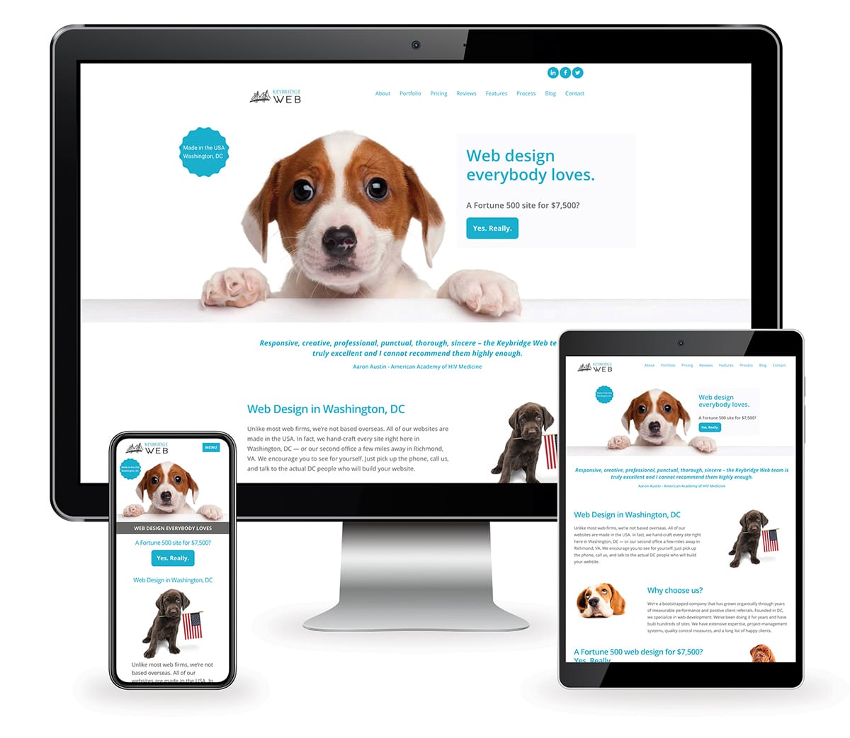
Here’s how our homepage actually responds between desktop, tablet and mobile. More on this later.

These numbers are, of course, just rough estimates, but raises another question: what version would be the best baseline for scaling in the first place? Here we started with the desktop size of our home page, but can we design for a smaller screen and just scale up from there?
The answer is, yes and no.
Mobile-first design is a current trend that tries to address this issue based on the fact that more and more users are browsing the internet on mobile devices than desktop computers. But trends aside, many of us still prefer to point-and-click instead of tap. When viewed on larger screens, these mobile-first designs are at best overwhelming and at worst a graphic designer’s nightmare.
In case you were curious, here’s what our home page would look like if the mobile version were scaled up to desktop. Helpful for if you want to gaze adoringly into the pupper’s eyes, but not much else.

So, then, how is responsive web design different?
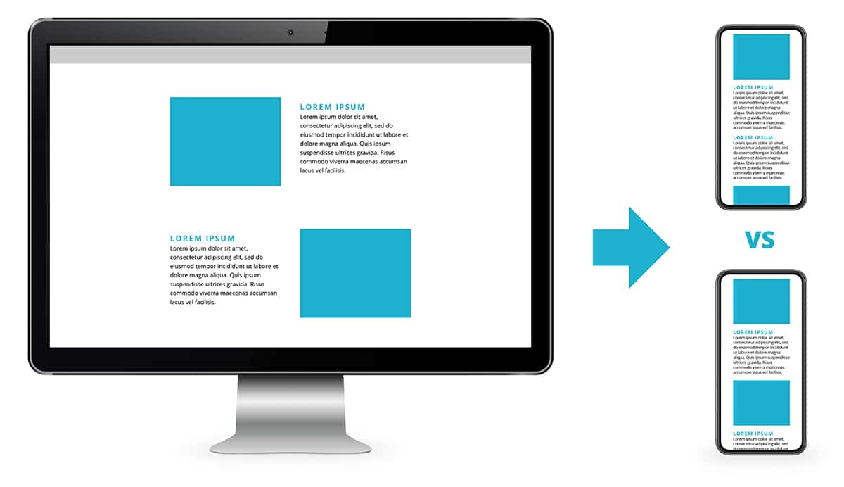
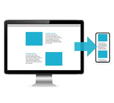
As suggested by the name, responsive websites respond to the screen size of the browser on which they are loaded. Often with WordPress websites, this will happen automatically. For example: On our Keybridge Web homepage, we have alternating rows of two columns, with one column containing a text block, and in the other, an accompanying image. On mobile, these elements stack to one column, so that both the text block and its image can use the full width of the screen and remain easily legible while retaining their relation to one another.
Of course, the computer’s best guess may not always be the most aesthetically pleasing design solution, and sometimes requires a little human intervention. Continuing the example, by default our alternating rows would stack to one column in the same left-to-right order they are placed on desktop: image, text, text, image, image, text, etc. Humans, however, would read these sections in chunks: text and image, text and image, text and image. So the designer “tells” the computer in its own language to show these elements in a more logical order: image, text, image, text, image, text.

Ultimately, visitors to your website are still receiving the same information regardless of how it’s being shown on their particular device. But how long visitors stay on the page and how much they are able to take in is very much dependent upon how well that material is presented. It’s no secret that we humans generally like pretty things, and web design is no exception.
At Keybridge Web, we habitually check every website we develop on multiple devices and screen sizes to ensure that all versions are visually appealing, and make adjustments as necessary.
Ready to see how responsive design can improve your website? Get in touch!


