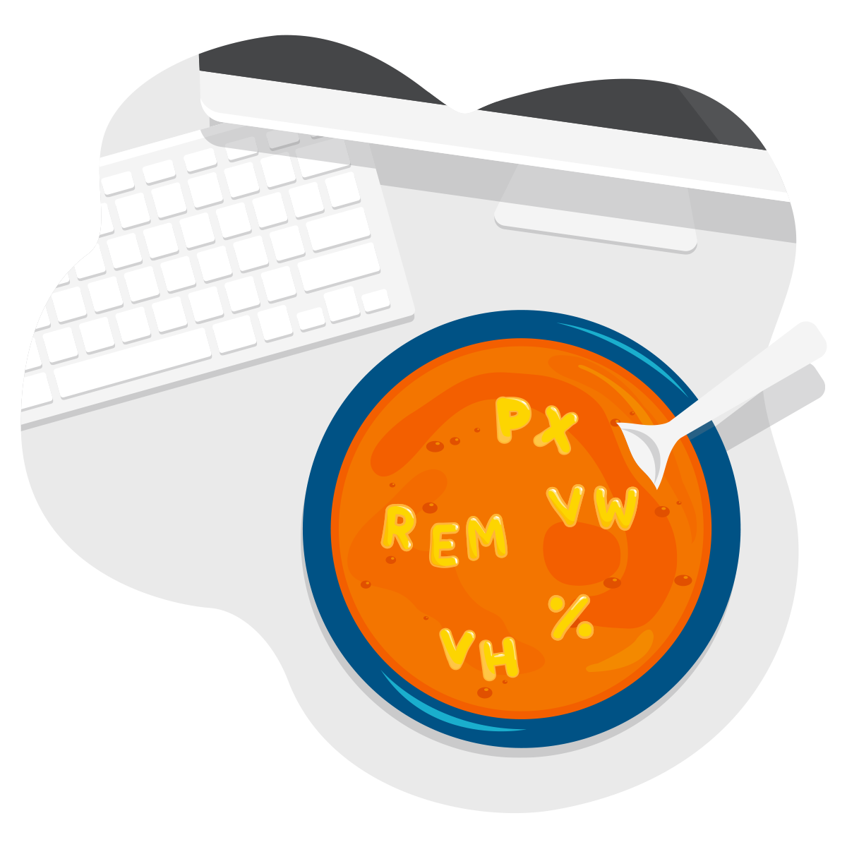
If you’ve spent any amount of time in a website pagebuilder, you’ve probably seen at least one of several units of measurement frequently used in digital applications. At a glance, it can be difficult to know the difference between the options available in this alphabet soup, and which selection is appropriate for your specific need. Here’s a helpful guide.
px
The px unit refers to pixels, and is literally just that. The tiny squares that form the text and images on your screen offer a logical basis for measuring those same text and images. Pixels are an absolute unit of measurement, meaning that an element with a defined pixel size viewed on mobile will be the same size on desktop if you hold the screens side-by-side. Pixels are almost identical to points (pt) in print measurements – so a 12px font on the web is roughly equivalent to 12pt text in a print document. Unless separate values are set for an element on different screen sizes, a 72px square will be about an inch on any screen size.
em/rem
These units of measurement get their name thanks to an old typesetting term used in letterpress printmaking. “Em” refers to the height of an uppercase “M” in a given font. In web applications, it is a relative unit of measurement that refers to a defined font size (usually in pixels) elsewhere on the site.
Functionally, em and rem are almost identical. While rem specifically refers to the global paragraph font size of the site (the root element), em can vary depending on the font size set for the parent element.
If you have a global paragraph with a font size set to 16px, with a line-height of 1.5em, the baseline of each line of text within the paragraph will be vertically spaced apart at 150% – that is, each line will have about 8 pixels (24px – 16px) of space between them. If that same paragraph is given a 1em margin-bottom, there will be 16 pixels of space between each paragraph of the same style.
Usually, em and rem will refer to the same dimension unless the parent element has a different specific font size set. Perhaps you want to control the font size of a navigation menu independently of the global paragraph style, and set the font-size of the top-level navigation to 20px on desktop, 16px on tablets, and set the dropdown menu items to 0.8em (that is, 80% of the topline menu’s font size). The browser will then render the dropdown menu as 16px on desktop and 12.8px on tablets, without the need to manually input those specific pixel dimensions within the page builder.
%
Percentage is another relative unit of measurement that refers to the height or width of the parent element (container) of a given object. Say for instance, you have a call to action box with some text and an image, and want that image to be half as wide as the box. Setting that image’s width to 50% will do just that, without the need to calculate specific pixel dimensions for every screen size.
vh/vw
Both of these relative units function similarly to %, but specifically reference the viewscreen, or window size, on a device. Short for viewscreen height (vh) and viewscreen width (vw), both are useful for creating sections that take up a large swath of space in proportion to what’s visible on the screen. For example, a hero section that is 100vh tall will be exactly as tall as the browser window, filling the screen no matter what size.
To recap, here’s a quick table summarizing what dimension informs each unit of measurement:
| px | absolute (screen pixels) |
| em | relative to parent element font size |
| rem | relative to global paragraph font size |
| % | relative to container’s width or height |
| vh | relative to viewscreen height |
| vw | relative to viewscreen width |
All of these units of measurement, with the exception of px, are relative to some other dimension. This plays a key role in responsive web design – making sure that all elements on a webpage are optimized for both aesthetics and legibility on every screen size. The decision between which units of measurement to use in any given instance can be fairly nuanced. Luckily, part of the beauty of designing for the web is that there are many available paths to a similar result.