As a think tank or research institute, your website needs to convey complex information in a straightforward way. Charts and graphs help a reader analyze and understand what you’re saying and create visual interest. They’re a great addition to any site, but they can also be clunky and require complex coding. We’ve recently found a tool that can help you create, manage and embed charts and graphs directly into your WordPress site.
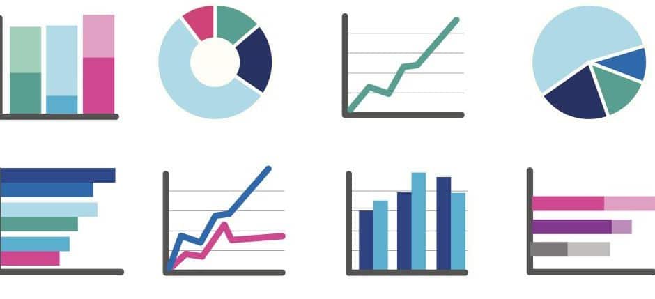
WordPress Visualizer is a plugin that allows you to build and customize nine types of charts: line, area, bar, column, pie, geo, gauge, candlestick and scatter. It provides really straightforward default settings that allow you to just plug in your data and go. Or, for a more personalized format, you can custom configure options to manipulate precisely how the chart presents information. There are tons of colors and styles to choose from and your charts will embed seamlessly into your site – you just create the chart with the Google Charts app and copy and paste the code into your site.
This plugin uses Google Visualization API – the most widely used visual-making technology – making in compatible with any web browser and the iOS and Android platforms. Anyone with internet access, whether on a computer, iPad or smartphone, will be able to see and understand your graphics.
We think this technology would be great for think tanks that want to focus efforts on collecting and analyzing data, not on coding to make sure the chart shows up.
Keybridge Web specializes in websites for environmental organizations. To learn more, click here.